A Delicious Design For A Brand New Kitchen

 Writing about this recent two room online design project left me dreaming of food this morning.  Not only for obvious reasons that it's a kitchen and dining area, but also because the finishes we chose for this space remind me of some of my favorite food combinations.  


Chocolate and raspberries, steak and red wine, black forrest chocolate cake and cherries came to mind.


This design was created for Susan's home which is currently undergoing renovations.  Here is a true to scale floor plan illustration of her new kitchen and dining room...


You can see we provided to birds eye looks at the dining area to show how the table we chose for her fits into the space when the extension is in place.  


The plan for the dining area includes a set of four chairs (five when the extension is in place)  upholstered in a beautiful blue floral fabric (Meadow Floral from Pier One).   The rest of the seating is provided by a character rich, custom built in banquet.  


A gorgeous chandelier, colorful mix of pillows and beautiful wine colored dishes bring color and style to this beautiful new corner of Susan's home.  


For softness, more color and drama, we used full length drapery panels to flank the sliding glass door that leads outside.  For the window over the sink, our recommendation was to purchase a table cloth from Pier One in the same fabric as the dining chairs (Meadow Floral), to use as fabric for a new valance.


The Kitchen is receiving a total makeover including new cabinets, flooring, counter tops, appliances, lighting and hardware.  Here is a look at some of the items we chose for the new space...


Over the island, we incorporated three hanging pendant lights from the same collection as the chandelier we placed over the dining table. 


We chose mid-toned wood floors and espresso cabinetry.  To keep the overall feeling of the space light and open, we incorporated light colored granite countertops and backsplash.  The wall color we recommended "Accessible Beige" by Sherwin Williams is also light and bright.  It provides amazing contrast to the dark cabinetry and pulls beautiful beige tones from the new countertops.  


A few well chosen, colorful accessories give the new kitchen a little personality while keeping the space neat and streamlined.


New upholstered barstools add comfort, function and softness to the island.  


A new floor runner in front of the sink also adds a layer of softness to the design (This rug is now available in a few different sizes in my shop, please click here for more details). 


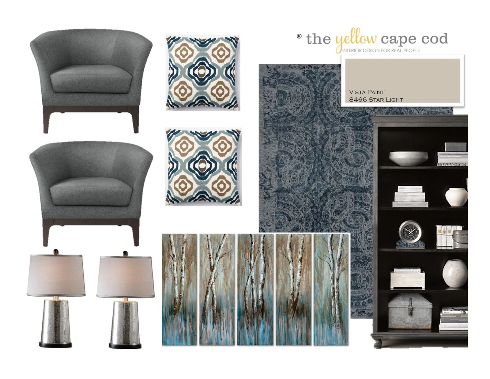
Soft blue, tan, chocolate and raspberry-wine create a rich yet serene color scheme for the Susan's brand new kitchen and dining area.  Here is a look at both designs together...


Thanks for stopping by. 
For information on my affordable online design consultation service, please click here
 ® The Yellow Cape Cod is a registered trademark.

Mixing Finishes/Upholstery For a Custom Design

Hi!  I can't wait to show you what I've been up to this week.  In addition to a few exciting projects going down at my house, we are officially having our busiest season yet in the design studio.  The timing for this "rush" of online design requests couldn't be more perfect.  Spring inspiration is in the air and we are having so much fun creating new, exciting spaces.   

This family room design that we created for Courtney and her young family is hot off the press…


 Our goal was to give her a family room that is young and high in style, while maintaining a comfortable, family-friendly environment.   To achieve this, we used a smart mix of metals, finishes and upholstery fabrics to create a contemporary, custom design that is approachable.  


A mix of upholstery materials keeps gives the design depth.  A structured, rich leather sofa paired with sleek, contemporary chairs covered in heathered wool is a dynamic combination.  


In addition to mixing the upholstery material, we also combined different wood tones and finishes within the space.  These round end tables from Restoration Hardware lend a weathered wood tone that keeps the overall feeling casual.  The bookcase we chose has an incredible zinc patina finish that is rich and unique. 


Scale was very important in this design.  Courtney's room is large, it was important that the accessories we chose were substantial ast to get lost in the space. While searching for something large to place over her sofa, we discovered this gorgeous large scale art.   Birch trees painted in hues of bold blues, warm grays and charcoal are painted on a series of five canvases lends an element of nature to the design.  This art is now available (and on sale)  in my shop, please click here for more details.


 Keeping scale in mind, we chose these gorgeous, large-scale mercury glass lamps for the end tables.  As jewelry is to an outfit, this lamp is the perfect shiny element that finishes off the room.  The style is contemporary while the crackled mercury glass finish adds a hint of nostalgia. The gray shade made them the perfect choice for this design.  


The area rug we chose from Potterybarn is soft and comfortable which makes it perfect for a young family.  It has an interesting pattern in a monochromatic color scheme that grounds the space without competing with the other patterns we used in the design.  


Speaking of other patterns, we chose a fun collection of pillows to give comfort, color and interest to the sofa and chairs.  


In addition to these new items, Courtney's design plan included a few existing design elements.  Her existing end table looks great in between the new chairs.   The room was already painted a fabulous paint color.  "Star Light" is a nice neutral that looks amazing with the new design elements.  


Courtney had also recently purchased these scribble drapes from West Elm, they work perfectly with this new design.


.  
To show how everything fits into the space, here is a look at the true to scale floorplan we created of this room.  This birds-eye view not only shows how each piece fits, but also illustrates the furniture arrangement and placement of the area rug.    

Along with new product recommendations and a complete product source list we also provided details on why we chose each piece.  In the event anything we recommended is not perfect, it can easily be substituted by choosing items with the same general qualities (size, color, style).  We also made recommendations for custom design elements to add character to the space; such as woodworking and a gorgeous fireplace makeover.


If you would like to get started on an online design plan for your home, now is the time.  Spring renewal has us majorly inspired! 

Thank you, Courtney for giving us this opportunity.  
For information on my affordable online design consultation service, please click here
 ® The Yellow Cape Cod is a registered trademark.

Family Friendly Home Office

Today's featured online design plan is a for a multi-purpose, family friendly, home office.  
Our client came to use looking for a stylish, as well as functional design that allows both the children and the adults to work in this space together.  


We divided the room into two separate areas, one side is for the kids and one side is for Mom and Dad.  The kids area features two desks and a gallery wall that incorporates back pack storage, homework organization and artwork display.  


Mom and Dad's side features a large, gorgeous desk system for two.  To make the separation between the kids area and the adult area, we used two different areas rugs to define and ground each zone.  
We chose a family-friendly, indoor/outdoor area rug for the kids zone.  This rug is available in my shop, please click here for details.  The fun bold print makes a statement in the room while the practicality of an indoor/outdoor rug makes this a great choice for a hard-working kids space.  

For the grown up area, we chose a sophisticated, luxurious, 100% wool rug (also available in my collection, click here for details).   This beautiful rug brings color and pattern to the space, the contemporary floral design compliments the bold graphic design of the kids rug.  


Our homeowner already had two desks for the kids from Ikea.  Our suggestion was that she swap out her existing white desk tops for the espresso colored tops to coordinate with the new desk system  for the adults.  We chose this beautiful Bedford collection from Potterybarn in a rich espresso finish to create a comfortable, functional and stylish work area.  Our layout includes the corner desk, small desk and bookcase).  


Over the parents area is a perfect spot for large scale art.  To keep in line with the family office theme, these world map canvases from Bassett Furniture were a great choice.  


Office spaces by nature have a lot of hard surfaces.  To soften the design, we introduced full length drapery in a nice, neutral color.  


The room already has a gorgeous neutral wall color (BM Moccasin) that looks amazing with the new design elements. 


This project was a lot of fun.  It is a good example of how a well-planned office space can perform a lot of duties for multiple family members and look great all at the same time. 
Thanks for stopping by. 

For information on my affordable online design consultation service, please click here
 ® The Yellow Cape Cod is a registered trademark.

Spring Centerpiece With Tulips and Pussywillow

In honor of the first days of spring, I thought it would be nice to revisit one of my favorite spring time centerpiece projects (even though it's still snowing here in Detroit).  The photos in this post are some of my most-pinned.  Feel free to pin away and share this simple, but high impact centerpiece.  


Recently, I shared our Spring/St. Patricks Day table scape with a large spring tulip and pussywillow centerpiece.  Today, I'm going to show how I made it.


This is one of the easiest centerpieces ever and probably my favorite.  Aside from being a sign of spring, the combination of sweet tulips and soft pussy willow are guaranteed to make you happy.  
Someone once told me that it's impossible to say pussy willow and not smile.  


Did you try it?  They're right :).

Here is what I used to create this centerpiece:
One bundle of pussy willow ($5) from Sams Club,  two bouquets of white tulips ($10ea.) from the grocery store and one small storage basket from Target. 


Two water glasses slightly shorter than the basket made inconspicuous vases to keep the tulips hydrated. 


I placed the tulips inside the glasses, filled them with water and tucked them inside the basket.  


**Within a few hours the tulips should start to fall naturally. 
If you are putting this together at the last minute and can't wait for them to release on their own, you can speed up the process by using luke warm water inside your vases.  Manipulating the bouquet with your hands will also help them loosen up, just keep in mind your arrangement may not last as long. 

Once they have released, they will fill the empty space around the perimeter of the basket beautifully.


Using utility scissors, I separated the pussy willow branches and stuck them into the tulips.  I like to keep the branches long to create a large scale centerpiece.  


Starting from the center, top of the arrangement and working my way to the outside corners helped me space the branches evenly. 


Tulips are thirsty, I check the water level each day.  
If you missed the rest of this tablescape, click here to see the original post.  


For details on this entire table setting, please click here. 
Happy Spring!


© Copyright 2013 The Yellow Cape Cod
For information on my affordable online design services, please click here. 
Related Posts Plugin for WordPress, Blogger...
 
SITE DESIGN BY DESIGNER BLOGS