Makeover Target Style~No-Sew Custom Shower Curtain Trick


Any day spent at Target is a good day, right?  This recent makeover project lead me there.
   Combining the client's previously owned art with off-the-shelf Target merchandise this guest bathroom was transformed.  This project was a fun example of "Home Styling".  Without any major renovations, just merchandise staging, this bathroom was dramatically updated.  


{Before}


The makeover began with a pair of canvas prints that belonged to Lynn, the homeowner.  Using the art as inspiration, the rest of the new design was conceived in one afternoon at Target. 


Lynn wanted a fresh new look without a complete overhaul of the space.  Therefore, we choose a color palette that complimented the existing surfaces (green floors and countertop).  


New paint, fresh towels and colorful accessories gave the room a cheerful new look. 


We used two wall colors, soft buttery yellow "Shortbread" and spicy, warm orange, "October Leaf" both by Martha Stewart. 


The art tied the new color palette and green surfaces (floors and countertop) together.  It was also the element that personalized the space keeping it from looking like it was completely designed at Target. 


Semi-Custom Shower Curtain Trick

To give the shower a sophisticated, custom look without any sewing,  I used a decorative tension rod and a pair of these...


                                              ...84" window drapery panels.


                        {Before}                                                                        {After}


This pair of window drapery panels was taller and fuller than a typical off-the-shelf shower curtain. 

Thank you, Lynn for inviting me into your home.
 For information on my affordable online design service, Please Click Here.   


© Copyright 2013 The Yellow Cape Cod

Q and A~The Details On My Black Painted Doors


Happy Monday! Some of the most frequently asked questions I receive have to do with my black interior doors.  It's been a couple years since I took on the task of painting them, but I thought a post addressing the most common questions could still be helpful.  


Q: Did you paint every door in your home?
A: When we moved into our home, it was a brand new builder spec.  The interior doors were primed and painted white.  To add drama and interest, I painted every door on the first level black (including closets and the pantry).  

Q: Did you remove the doors prior to painting them?
A: I did not remove the doors prior to painting.  This was a task I took on myself while my husband was out of town.  Removing and replacing doors can be tricky and definitely requires two people.  I removed the door knobs but left all other hardware in tact while painting.

Q: What paint finish did you use?
A: I used black latex interior paint in a satin finish.  Using a roller and a high quality paint brush, I applied three coats of black paint to all sides of each door.  I started using the color "Ace of Spades".  It looked great, however, during this process, I stumbled upon the black paint of my dreams, "Silhouette" by Martha Stewart so, I started over.  Silhouette is a deep, true black. 

Q: Did you prime the doors prior to painting?
A: It's always a good idea to spot test before tackling this project.  Most of the time, I would prime prior to painting.  In this case, I knew the doors were originally primed and painted with chalky, flat latex products, therefore I had no worries about the new paint adhering.  I did not use primer.  If your doors have ever been painted with glossy paint or oil-based enamel, they will require special treatment.  Spot checking with a paint sample in an inconspicuous area will help you determine this.

Q: In an active house full of kids, how has the finish lasted?
A:  The finish has held up great.  The pantry door (the door that gets the most action in our house) has been nicked a couple times.  I keep a sample of paint handy for touch ups.   Other than that, I have had no issues with chipping.  If anything, the black finish helps hide the dirty little handprints that used to appear everywhere.   


I hope that helps you decide if this project is right for you. 
If you have addtional questions please feel free to leave them in the comments.  I'll be back this afternoon to answer them! 


*For information on my affordable online design service, please click here. 

© Copyright 2013 The Yellow Cape Cod

Big Emtpy Walls~ Two Simple Solutions


{At the end of this post, I dropped one last hint about a big announcement coming soon}.
Recently, I asked you to share your decorating dilemmas with me.  One of the most popular responses  was how to deal with large empty walls.     

Today, I'd like to share two simple solutions using a recent online design project as an example. We had the privilege of creating an online design plan for the entire main level of a beautiful new home.  The family room was gigantic.  Soaring two story vaulted ceilings, floor to ceiling panoramic windows and an amazing two story fireplace gave the space a grand feeling.  However, these features also gave us the challenge of a lot of wall space. 


Solution # 1 Paint Trick

Using this photo as inspiration...


...the client painted the two story fireplace wall dark gray.  The color was a few shades darker than the main wall color.  This instantly helped to break up the empty wall space.  It created a dramatic focal point and grounded the large open space.  


Solution # 2 Sneaky Art Trick

Above is the art we placed in her family room.   Even though this pair of prints is oversized and large in scale...  


...it still wasn't enough to fill the vast two story wall behind her sofa. 


Our solution was to purchase two sets and hang them as shown below: 


 By turning one set upside down, it gave the illusion that all four prints were different. 

Depending how tall your walls are, you could purchase three or four sets.  Turning them sideways is another variation.  In most cases, the hangers can be removed and repositioned on the back of the print.  If not, new hangers can be installed easily.  


 I'll be making an exciting announcement very soon.  The art featured in this plan may have something to do with it:).  If you're curious about the source of these prints, stay tuned!

For information on my affordable online design services, Please Click Here

© Copyright 2013 The Yellow Cape Cod


Hard Working Formal Spaces~Form and Function Unite


One of the most common decorating dilemmas I'm presented with is how to create a hard working, multi-functional space that looks great.  Using this recent online design project as an example, I'm going show how we gave a client's formal dining room/living room combination a split personality.      

Our goal in this two-room design plan was to create a space that was not only a beautiful, well appointed formal living room and dining room, but also a place for the homeowner, Karen, to run her home-based fashion merchandise business.   


Here is what we came up with:

{The Dining Room}


Karen often holds trunk shows in her formal dining room and living room (located in the front of her home, flanking the foyer). We gave her a design that functions well for everyday family life and also provides a stylish setting for fashion parties.   Instead of hiding Karen's business merchandise away we embraced it and found ways to showcase it. 
Like art.  


Karen has fabulous antique dining furniture including a glass front cabinet.  The image above shows how the cabinet could be used to display fashion accessories.  Purses, jewelry, and hats could be used in place of shoes which may not be the most appetising display for a dining room.  

In the adjacent living room, Karen's antique furniture is getting a new look with fresh upholstery and pretty pillows. 


{The Living Room}


Iron garment racks and a beautiful floor mirror from Potterybarn are functional for her business as well as interesting and unique accent pieces for everyday living.


By allowing Karen's fashion merchandise to function as art the space is beautiful, unique and most importantly, tells "her story". 

Here are the two spaces next to each other:


More to come this week, including suggestions for another common design dilemma and another hint about my upcoming announcement.

For information on my affordable online design service, please click here

© Copyright 2013 The Yellow Cape Cod


Sofa image found here

Gorgeous, Classic, Navy And Khaki


A quintessential color palette {navy blue and khaki}, traditional style furniture and equestrian art come together as the trinity of classic style in today's featured online design plan.

Our goal in this space was to create a timeless family room punctuated with a few unexpected design elements. This space is understated and elegant, but definitely not boring.


If this room were a person...

{source}  


The design began with this large graphic horse print from Ballard Designs.  It will be the perfect focal point over the sofa.


The chair selected for this space has a slim profile and a contemporary pattern.  The amazing navy blue denim fabric keeps it feeling casual.


Slightly distressed finishes and natural texture baskets keep the room comfortable and welcoming. 


An unexpected, dramatic painted ceiling treatment is also in the plan.  This element along with a few well placed, colorful accessories will give this overall classic space an edge.  

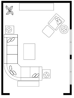
  We provided two great options for furniture arrangement...


These versatile pieces allow the freedom to switch up the furniture placement anytime they crave a change.  


© Copyright 2013 The Yellow Cape Cod


Thank you, Jennifer for inviting me into your home. 
I enjoyed working with you and this project was a lot of fun. 


Who am I kidding, all projects are a lot of fun!  
To reserve your affordable, custom online design plan, please click here.  


Ladera Ranch Magazine Articles


For the past few months, I have had the pleasure of being a contributor at Ladera Ranch Magazine.  It has been a ton of fun introducing DIY Decorating 'Detroit-Style' to this beautiful California based lifestyle publication.  


In the last issue, I shared holiday decor and tips on throwing a sophisticated New Years Eve Soiree in your living room.  My article in this months edition features three quick and easy DIY projects to kick off the new year;  The Hallway Command Center,  Personalized Framed Quote, and Thrift Store Chair Makeover.  

{You can view the full digital edition, here.  It's a great magazine, I read it front to back in one evening}.  


Thank you, Ladera Ranch Magazine for this opportunity.  It's been a pleasure working with you.  I'm really looking forward to upcoming articles in the Spring issue.

My boys would like to thank you as well, they are very excited to have their team photos and sports trophies "in a magazine".


© Copyright 2013 The Yellow Cape Cod
Related Posts Plugin for WordPress, Blogger...
 
SITE DESIGN BY DESIGNER BLOGS