If you would like me to get started on a design plan for your home, click here for information.
I get so excited when
a design plan comes to life. It's like having a baby even though it's not mine. I have a dramatic living room makeover to share with you today.
You may remember this room from my posts about
the most beautiful coffered ceiling ever and
how to style a bookcase in four simple steps. This space was originally two rooms, an office and a dining room. Before I came onto the scene Erik and Sara (the homeowners) along with Architect, Christopher Macklin and Carpenter Rob Toth removed a wall separating the two rooms creating one large open space with an amazing coffered ceiling. For more "before photos" and details on the ceiling
click here.
Here is a look a the room the first time I saw it…
Erik and Sara called upon me to create
a design plan for their new living room. This included new furniture (as well as incorporating some of their current pieces), lighting, window treatments, paint colors, rugs, art, and accessories. After consulting with Erik and Sara, I had a feel for their style preferences, budget and how they wanted the room to function.
Here is the inspiration board from the
design plan I created for them…
Erik and Sara are my neighbors, so I took this opportunity to work with them on site to demonstrate how a design plan comes to life. I also used their bookcase styling project to share my "four simple steps to a great bookcase display".
The room is now complete. I stopped by the other day to take these "after" shots. Little miss Sophie, (one of Erik and Sara's adorable children) helped me with this tour.
Here is a look at the finished space…
Two zones were created in this (now) large, open room. The first zone is a reading area with a pair of accent chairs and ottoman by the bookcase. The other end of the room is a conversation zone with a pair of arm chairs, sofa and occasional tables.
I used two different area rugs to anchor and define each zone. A wool patterned rug for the reading area and a cozy, shaggy, solid colored rug for the conversation zone.
For window treatments, I kept them simple, soft and light with relaxed roman shades in off white linen.
I mentioned in my sneak peak post on this space that there was a surprise accent color. You will see in these photos that the adjacent rooms are painted a beautiful aqua/sea glass green (Drizzle by Sherwin Williams).
In the new living room, the wall color I chose was "Gray Squirrel" by Martha Stewart.
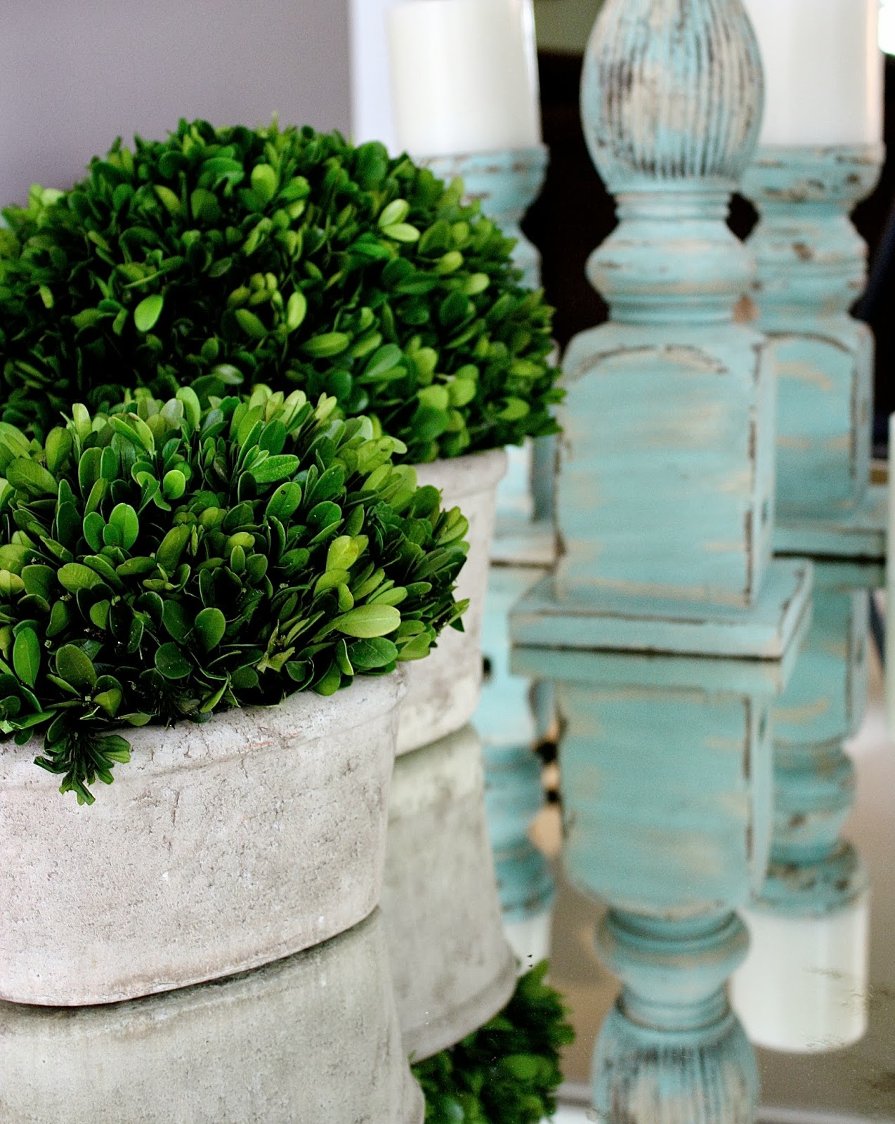
I brought in a hint of the sea glass color with a few accents.
It allows the new room to flow with the adjacent areas.

To read the post on how I styled this bookcase in four simple steps,
click here.
Erik and Sara already had the pair of accent chairs tucked away in another space. I brought them in to create a reading area next to the bookcase. I could not find an ottoman that matched the chairs exactly so I chose one that is made with three different fabrics. This helped the chairs blend with the ottoman, so it didn't look like an afterthought.
Beans the dog has his favorite spot in front of the window.
This new large open room is separated from the kitchen/great room by a pair of pocket doors.
This gives them the option to close this room off for privacy or open it up for entertaining.
The conversation end of the space includes this sumptuous charcoal gray velvet sofa.
Over the sofa, we placed a large rectangular mirror in a sea glass green distressed finish. There is a story behind this mirror that deserves it's own blog post (including a tutorial). Watch for that later this week.
The wall opposite the sofa and green mirror is a space for a revolving art gallery. Sara and Erik are travelers and love to collect art. Right now, they are displaying a beautiful piece with soft greens and blues that play up on our accent color. They plan on changing the art with the seasons.
Here you can see the sea glass wall color in the adjacent hallway. You may also notice the numbered stairs. The previous owners of this home had a whimsical design style.
Now that Erik and Sara occupy the home with more traditional decor, the numbered stairs are a fun and unexpected design element To keep the new living room from being too serious for the rest of the house, whimsical elements such as an oversized bird cage floor lamp were incorporated.
The combination of elegance and whimsy is a perfect representation of this family.
Young, fun yet sophisticated.
Stay tuned for a tutorial post dedicated to these large black and white framed photos. They have special meaning to the family and I'll show you how we made them look extra special.
Now that Erik and Sara's living room makeover is complete, they have a clear view of the gorgeous scene outside of the windows. Before, the wall and extra pocket door blocked the windows off from the rest of the home trapping the view (and the sunlight) inside a small den.
These spaces are now filled with natural light and offer a clear view of the front yard.
Take a look...
Who wouldn't want to look at this everyday?

Thank you, Erik and Sara for welcoming me into your home and giving me the opportunity to design for you. Also, thank you Sophie for helping me with this tour.
For information on how we can get started on a design plan for your home,
please click here. No home is too far for my online design service.
Click here for more room makeovers.
© Copyright 2013 The Yellow Cape Cod
Feel free to pin!